Layout Options
The Layout Options tab lists options that may be used to customize the appearance of the Design Canvas in the Bill Designer. The options available are Default View, Units, Grid Settings, Grid Size and Align Controls to Grid.
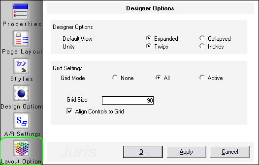
DESIGNER OPTIONS
Default - Allows the user to determine whether they would like the default view of a section to be Expenses or Collapsed. Expanded View shows the detail of all optional subsections. Collapsed hides the detail of all optional subsections.
Units - Allows the user to show measurements throughout the designer in Twips or Inches (1440 twips is equal to 1 inch).
GRID SETTINGS
Grid Mode - Allows the user to show the alignment grid in all sections, just in the active section, or in no sections. The grid will not print on the prebills or final bills, it is simply a grid of dots in the background of the bill canvas that is helpful in aligning fields.
Grid Size - Defaults to 90 twips (or 6/100ths of an inch) but the grid size may be changed to any size between 60 and 720 twips (0.04 inch to 0.5 inch).
Align Controls to Grid - Align controls to grid option may be checked or unchecked. When checked, the fields added to the design will automatically be ‘snapped to the grid’ – otherwise the fields will be placed exactly where they are dragged and dropped. When a field is ‘snapped to the grid‘ - that means that when a field is added or moved, the top right corner of that field will automatically jump to the closest gridpoint to that corner. This means that every field will be aligned to a point on the grid, and is helpful in assuring that all fields are aligned precisely.